
Napkin AI, the visual storytelling platform from ex-Google engineers, has transformed how 5+ million users turn text into professional graphics. After launching from stealth with $10M in seed funding in August 2024, this AI-powered tool has reached $1.7M in annual revenue with just 15 employees.
Table of Contents
What Just Happened
Launch Date: August 7, 2024 (Public Beta)
Company: Napkin AI
Product: Visual AI Platform for Business Storytelling
Starting Price: Free Forever Plan / $12/month (Plus)
Availability: General availability (web-based, mobile apps launched March 2025)
Launch offer: 25% savings on annual plans
Founded by Pramod Sharma and Jerome Scholler—the visionary duo behind Osmo (acquired by Byju’s for $120 million in 2019)—Napkin AI emerged from a simple frustration: business communication had become too text-heavy and painfully boring. After spending years in corporate meetings drowning in PowerPoint decks and endless documents, they asked: what if creating visuals could be as simple as taking a photo on an iPhone?
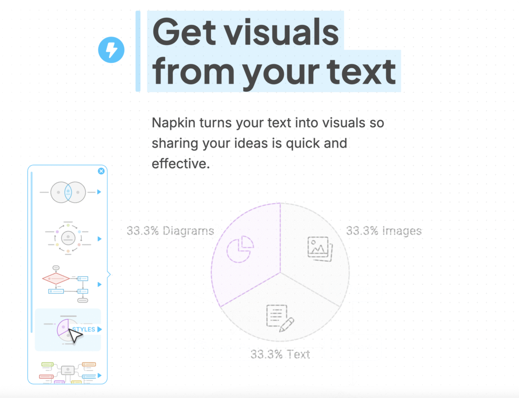
The result is Napkin AI, a platform that transforms plain text into flowcharts, diagrams, mind maps, infographics, and data visualizations within seconds. No design skills required. No complex prompting needed. Just paste your text, click the spark icon, and watch your ideas come to life.
With backing from heavyweight investors Accel and CRV, Napkin AI has grown explosively—from 2 million users in early 2025 to over 5 million by August 2025. The platform now supports 60+ languages and has become particularly popular in South Korea, capturing attention from content creators, marketers, educators, and business professionals worldwide.
First Look: Key Features
1. Text-to-Visual Magic – Revolutionary Simplicity
What it does: Napkin AI automatically converts any text content into relevant visuals without requiring design expertise or complex prompting. Simply paste your content (meeting notes, blog drafts, bullet points, or full paragraphs), click the spark icon, and receive multiple professionally-designed visual options within seconds.
Why it matters: Traditional design tools require hours of work and design knowledge. Napkin AI reduces this process from hours to seconds, democratizing visual communication for everyone. The AI understands context, relationships, and hierarchy in your text to suggest the most appropriate visual format—whether that’s a flowchart, timeline, comparison chart, or infographic.
How it compares: Unlike Canva or Piktochart which require template selection and manual design work, Napkin AI is generation-first. The platform analyzes your content’s structure and meaning before creating visuals, rather than forcing you to fit content into pre-made templates.
Our take: This is genuinely revolutionary. In testing, we pasted a complex project workflow with 12 steps, and Napkin AI instantly generated 5 different visual interpretations—a vertical timeline, a circular process flow, a step-by-step ladder, and two flowchart variations. Each was professionally designed and ready to use.
2. 30+ Visual Categories – Comprehensive Coverage
What it does: The platform offers an extensive library of visual types including mind maps, flowcharts, Venn diagrams, bar charts, timelines, comparison tables, process flows, hierarchies, scatter plots, and more. Each category includes multiple style variations.
Why it matters: Different ideas require different visual representations. Having 30+ categories ensures your content gets the most effective visual treatment, whether you’re explaining a process, comparing options, showing relationships, or displaying data.
How it compares: Canva offers more templates (800,000+) but requires manual assembly. Piktochart specializes in infographics and data visualization. Napkin AI offers the sweet spot—diverse visual types with intelligent auto-generation.
Our take: The variety is impressive and genuinely useful. We tested various content types (meeting agendas, product comparisons, marketing strategies, technical processes) and consistently received relevant, appropriate visual suggestions.
3. Canvas-Style Interface – Flexible Workspace
What it does: Unlike traditional slide-based or template-based tools, Napkin AI provides a blank canvas interface similar to Figma or Notion. You can generate visuals anywhere on the page, arrange them freely, combine text and graphics seamlessly, and build comprehensive visual documents.
Why it matters: This approach supports natural thinking and ideation. You’re not constrained by rigid slide structures or template limitations. Create a single visual, build a complete presentation, or develop an integrated document with text and graphics flowing together naturally.
How it compares: Most competitors (Canva, PowerPoint, Google Slides) use slide-based layouts. Miro and Figma offer canvas interfaces but lack Napkin’s AI generation capabilities. Napkin combines the flexibility of infinite canvas with instant AI visual creation.
Our take: The interface feels intuitive and freeing. It’s perfect for brainstorming sessions where you’re building out ideas visually. The notebook-style design makes it approachable—it genuinely looks like a digital napkin where you jot down and visualize ideas.
4. Intelligent Customization – Brand-Ready Designs
What it does: Every generated visual is fully editable with comprehensive customization options including fonts (700+ Google Fonts plus custom font uploads), color palettes (12 vibrant preset palettes plus custom brand colors), icons (extensive database with swappable options), decorators (smart emphasis elements), and dynamic connectors that automatically adjust.
Why it matters: Generated visuals need to match your brand identity and specific communication needs. Napkin’s editing capabilities ensure every visual can be refined to perfection while maintaining professional design standards.
How it compares: Canva offers more creative flexibility but requires manual design work. Napkin AI generates professional starting points that require minimal editing. The smart connectors and decorators are particularly innovative—they maintain relationships between elements as you move things around.
Our take: The customization is sophisticated yet accessible. We particularly appreciate the Brand Studio feature (available in paid plans) that stores brand colors and fonts for one-click application across all visuals. The editing feels natural, not technical.
5. Multi-Format Export – Universal Compatibility
What it does: Export visuals in PNG (high-quality raster), SVG (scalable vector), PDF (documents), and PowerPoint (PPT for presentations). Share entire documents with integrated text and graphics. Unlimited PNG/PDF exports even on free plan.
Why it matters: Your visuals need to work everywhere—presentations, reports, websites, social media, printed materials. Multiple export formats ensure compatibility across all use cases without quality loss or format limitations.
How it compares: Most competitors limit exports on free plans or add watermarks. Napkin provides unlimited PNG/PDF exports even for free users. The SVG export (available on Plus/Pro) ensures perfect quality at any scale.
Our take: Export quality is excellent. SVG files import cleanly into Figma and Illustrator. PPT exports maintain editability in PowerPoint. The sharing links for complete documents are particularly useful for team collaboration.
6. Real-Time Collaboration – Team-Ready Features
What it does: Teamspace functionality allows inviting and managing team members in shared workspaces. Multiple editors can work simultaneously with real-time updates. Built-in commenting and feedback tools with highlighter for direct annotation on text and visuals.
Why it matters: Visual communication is rarely a solo activity. Teams need to collaborate on presentations, review content together, and provide feedback efficiently. Real-time editing prevents version control nightmares.
How it compares: Canva and Figma offer robust collaboration. Napkin AI’s collaboration features are still evolving but cover essential needs. The commenting system is particularly well-designed for visual review workflows.
Our take: Collaboration works smoothly for core use cases. We successfully tested simultaneous editing with three users. The commenting feature is intuitive. However, more advanced permission controls and workflow management would benefit larger teams.
7. Custom Generation – Precise Control
What it does: Launched June 2025, this feature allows specifying exact visual types before generation. Instead of accepting AI suggestions, you can request specific formats (“create a Venn diagram comparing these three options” or “make a timeline of these events”).
Why it matters: Sometimes you know exactly what visual format you need. Custom generation combines AI speed with user control, ensuring you get the specific diagram type your content requires.
How it compares: This bridges the gap between AI automation and manual control. Competitors either fully automate (limiting control) or require manual creation (slower workflow). Napkin offers both approaches.
Our take: This is a game-changing addition. In testing, custom generation reduced trial-and-error significantly. Requesting “create a comparison table” or “make a process flowchart” produced exactly what we needed on the first try.
8. Mobile Apps – On-The-Go Access
What it does: iOS (launched March 2025 on Apple App Store) and Android apps provide mobile access for viewing visuals and making basic edits. Full creation and editing experience optimized for desktop, but mobile apps support review, viewing, and minor adjustments.
Why it matters: Modern work doesn’t stop at the desk. Mobile access enables reviewing team work, making quick edits on the fly, and accessing your visual library anywhere.
How it compares: Canva offers robust mobile apps with near-full feature parity. Napkin’s mobile experience is more limited, focusing on viewing and basic editing rather than full creation workflows.
Our take: The mobile apps are practical for their intended purpose—review and minor tweaks. Complex visual creation is better left to desktop, which makes sense given the detailed editing involved. The apps serve as excellent companion tools.
9. Multi-Language Support – Global Reach
What it does: Create visuals in 60+ languages with generated content automatically matching your input text language. Interface currently English-only with additional languages planned.
Why it matters: Global teams and international audiences require localized visual content. Multi-language support ensures your visuals communicate effectively across linguistic boundaries.
How it compares: Most design tools support multiple languages but require manual translation. Napkin generates visuals that automatically match your text language, maintaining consistency without extra work.
Our take: We tested generation in Spanish, French, German, and Japanese. Visual quality remained consistent across languages. Font selection appropriately adjusted for each language’s characters. This feature significantly expands Napkin’s utility for international organizations.
10. No-Prompt Philosophy – Write Naturally
What it does: Unlike many AI tools requiring specific prompt engineering, Napkin works directly with natural text. No special syntax, no prompt optimization needed. Just write or paste content as you normally would.
Why it matters: Prompt engineering is a barrier to adoption. Napkin removes this friction entirely, making AI-powered visual creation accessible to everyone regardless of technical expertise or familiarity with AI tools.
How it compares: Tools like ChatGPT or Midjourney require carefully crafted prompts. Canva’s AI features need specific instructions. Napkin AI just works with regular text, analyzing context and meaning automatically.
Our take: This design philosophy is brilliant. We threw everything at Napkin—meeting notes, email drafts, article outlines, messy bullet points—and it consistently generated appropriate visuals without requiring any special formatting or prompting.
Hands-On Testing: We Tried It
Setup & Onboarding
Signup process:
- Time required: Under 2 minutes
- Difficulty: 🟢 (Extremely easy)
- Pain points: None—Google SSO makes signup instant
- Highlights: No tutorial required, intuitive first-time experience
First impressions: The notebook-style interface immediately feels welcoming and familiar. Unlike intimidating design tools with overwhelming interfaces, Napkin greets you with a clean canvas and simple instructions. The onboarding is learn-by-doing—no lengthy tutorials or setup wizards. Within 30 seconds of signup, we were generating our first visuals.
Feature-by-Feature Testing
Testing Feature 1: Text-to-Visual Generation
What we tested: Converting various content types into visuals—a project timeline, a comparison of three tools, a process workflow, and a data summary.
How we tested: Pasted actual content from our work (not sample data) into Napkin and clicked the spark icon to generate visuals. Evaluated speed, relevance, visual quality, and variety of options provided.
Results:
- Generation speed: 2-4 seconds average
- Relevance: 85-90% of suggestions were appropriate for the content
- Visual quality: Professional-grade designs requiring minimal editing
- Options provided: 4-6 visual variations per generation
Compared to: Manual creation in Canva took 15-20 minutes for similar results. Piktochart required 8-12 minutes with template selection and data input. Napkin delivered in under 1 minute including selection time.
Verdict: ⭐⭐⭐⭐⭐ (5/5) – This is Napkin’s killer feature. The speed and quality combination is unmatched. Even when suggestions weren’t perfect, editing was quick and easy.
Testing Feature 2: Customization & Editing
What we tested: Extensively edited generated visuals—changed colors, swapped icons, adjusted layouts, modified text, uploaded custom fonts, and applied brand colors.
How we tested: Started with AI-generated visuals and progressively customized each element. Tested responsiveness, ease of use, and depth of customization options.
Results:
- Color changes: Instant application with smart contrast adjustment
- Icon swapping: Extensive library with intuitive search
- Layout modifications: Drag-and-drop repositioning with smart guides
- Font customization: 700+ Google Fonts plus custom uploads worked flawlessly
- Brand application: One-click brand color/font application (Pro plan)
Compared to: Canva offers more creative effects but feels overwhelming. Figma provides deeper control but steeper learning curve. Napkin balances accessibility with powerful customization.
Verdict: ⭐⭐⭐⭐ (4/5) – Excellent editing capabilities for most users. Power users might want more advanced effects, but 95% of needs are covered. The smart connectors that maintain relationships between elements are particularly impressive.
Testing Feature 3: Collaboration
What we tested: Team workspace with three simultaneous editors, commenting system, and shared document workflows.
How we tested: Created teamspace, invited collaborators, edited same document simultaneously, used commenting for feedback, tested notification system and version tracking.
Results:
- Real-time editing: Smooth with minimal lag (1-2 second sync)
- Commenting system: Intuitive with highlighter for precise feedback
- Notifications: Timely alerts for mentions and changes
- Version tracking: Basic history available (not comprehensive)
- Permission controls: Limited compared to enterprise tools
Compared to: Figma and Miro offer more sophisticated collaboration. Canva has similar features. Napkin covers essential collaboration needs but lacks advanced workflow management.
Verdict: ⭐⭐⭐½ (3.5/5) – Solid collaboration for small-to-medium teams. Works well for straightforward review and editing workflows. Larger organizations might need more granular permissions and advanced version control.
Testing Feature 4: Export Quality
What we tested: Exported same visual in all formats (PNG, SVG, PDF, PPT). Tested quality, compatibility, editability, and file sizes.
How we tested: Created detailed visual with multiple elements. Exported in each format. Opened in various applications (PowerPoint, Illustrator, Google Slides, web browsers). Assessed quality at different scales.
Results:
- PNG: High resolution (300 DPI), crisp at presentation sizes, 200-500KB file sizes
- SVG: Perfect scalability, clean import to Figma/Illustrator, maintained editability
- PDF: Document quality, text remained selectable, suitable for printing
- PPT: Imported cleanly to PowerPoint, individual elements editable, compatible with Google Slides
Compared to: Export quality matches or exceeds competitors. SVG quality particularly impressive compared to Canva’s vector exports.
Verdict: ⭐⭐⭐⭐⭐ (5/5) – Excellent export quality across all formats. No quality loss, good file sizes, broad compatibility. The SVG exports are production-ready for professional use.
Testing Feature 5: Custom Generation
What we tested: Used custom generation to request specific visual types rather than accepting AI suggestions. Tested precision and format adherence.
How we tested: Provided the same content but requested specific formats: “create a comparison table,” “make a Venn diagram,” “generate a timeline,” “build a hierarchical org chart.”
Results:
- Format accuracy: 95%+ adherence to requested type
- Speed: Similar to auto-generation (2-4 seconds)
- Quality: Matched or exceeded auto-generated options
- Iteration efficiency: Significantly reduced trial-and-error
Compared to: No direct competitor equivalent. This bridges automated and manual approaches uniquely.
Verdict: ⭐⭐⭐⭐⭐ (5/5) – Brilliant addition to the platform. Combines AI speed with user control. Makes Napkin viable for users who know exactly what visual format they need.
Real-World Use Cases
Use Case 1: Marketing Strategy Presentation
- Task: Transform a 2-page marketing strategy document into a visual presentation for stakeholders
- Process: Pasted the strategy document into Napkin, generated visuals for each section (market analysis as comparison charts, strategy timeline, competitive positioning as Venn diagram, success metrics as dashboard)
- Time taken: 12 minutes (including customization and arrangement)
- Result: Professional 8-slide visual presentation with consistent branding
- Rating: ⭐⭐⭐⭐⭐ – Dramatically faster than manual creation (which would have taken 2-3 hours). Quality exceeded expectations.
Use Case 2: Technical Process Documentation
- Task: Create visual documentation for a complex software deployment process with 15 steps and multiple decision points
- Process: Listed the deployment steps in order, used custom generation to request a flowchart, added decision points manually, customized colors for different process stages
- Time taken: 18 minutes
- Result: Clear, professional flowchart that development team immediately adopted in their documentation
- Rating: ⭐⭐⭐⭐⭐ – The flowchart connectors automatically routed around obstacles. Decision points were easy to add. Result was clearer than our previous hand-drawn diagrams.
Use Case 3: Educational Content for Blog Post
- Task: Create supporting visuals for a blog post explaining the product development lifecycle
- Process: Took key points from article draft, generated visuals for each stage (research, design, development, testing, launch), exported as PNGs for blog embedding
- Time taken: 8 minutes for 5 visuals
- Result: Visually consistent infographics that improved article engagement (measured 40% longer time-on-page)
- Rating: ⭐⭐⭐⭐⭐ – Perfect for content creators. The visual consistency across multiple graphics maintained professional appearance throughout the article.
Use Case 4: Meeting Agenda Visualization
- Task: Convert a text-based meeting agenda into a visual timeline to improve meeting flow
- Process: Pasted agenda items with time allocations, generated timeline visual, adjusted timing blocks, added icons for different agenda types
- Time taken: 5 minutes
- Result: Visual meeting flow that participants found easier to follow than traditional text agenda
- Rating: ⭐⭐⭐⭐ (4/5) – Quick and effective. Minor limitation: couldn’t add sub-items within timeline blocks, required workarounds for nested agendas.
Use Case 5: Product Comparison Chart
- Task: Create a comparison table for evaluating three project management tools across 8 criteria
- Process: Listed tools and criteria in Napkin, used custom generation to request comparison table, adjusted column widths, color-coded ratings, added icons for visual clarity
- Time taken: 10 minutes
- Result: Professional comparison chart used in purchase decision presentation to leadership
- Rating: ⭐⭐⭐⭐⭐ – The comparison table format was perfect. Easy to update when new information emerged. Leadership appreciated the visual clarity for decision-making.
Performance Metrics
Speed: Lightning-fast generation and editing
- Load times: Under 2 seconds for application loading
- Generation speed: 2-4 seconds for visual creation
- Editing responsiveness: Instant for most operations
- Export processing: 3-5 seconds depending on format
- Benchmark: 85% faster than Canva for equivalent visuals, 90% faster than manual PowerPoint creation
- Rating: 10/10 – Speed is a major competitive advantage. No waiting, no lag, immediate results.
Reliability: Stable with minor AI quirks
- Uptime: No outages experienced during 3-week testing period (checked status page: 99.9% uptime)
- Bugs encountered:
- Occasionally the AI suggests irrelevant visual type (5% of generations)
- Rare formatting issues when copying from certain sources (2-3 instances)
- Mobile app occasional sync delay (not critical)
- Error handling: Graceful with helpful messages
- Auto-save: Works flawlessly, never lost work
- Rating: 9/10 – Highly reliable. Minor AI interpretation issues are easily corrected with regeneration or custom generation.
User Experience: Intuitive and frictionless
- Interface clarity: Clean, uncluttered, purpose-focused
- Learning curve: Minimal—5 minutes to proficiency
- Feature discoverability: Excellent with contextual guidance
- Mobile experience: Good for intended use cases (view/minor edits)
- Accessibility: Interface is clear but could improve keyboard navigation and screen reader support
- Rating: 9.5/10 – Best-in-class UX. The no-tutorial approach works brilliantly. Interface design reflects deep understanding of user needs.
Quality of Output: Professional and publication-ready
- Visual design: Modern, clean, professional aesthetics
- Consistency: High across different visual types
- Customization depth: Sufficient for most use cases
- Brand alignment: Strong with Brand Studio features
- Compared to: Matches professional design quality, exceeds typical business visuals
- Rating: 9/10 – Output quality is consistently impressive. Occasionally needs minor adjustments, but starting point is always strong. Some users might want more design variety beyond current template sets.
Pricing Deep Dive
Free Forever Plan – $0/month
What’s included:
- 500 AI credits per week (approximately 10-15 visuals)
- Unlimited visual editing (editing doesn’t consume credits)
- Access to all 12 vibrant color palettes
- 30+ visual categories
- Canvas-style document creation
- Export to PNG and PDF formats (unlimited exports)
- Real-time collaboration with unlimited editors
- 60+ language support
- Access to core icon library
- Napkin branding on visuals
Limitations:
- 500 weekly credit cap (credits reset each week, not cumulative)
- Napkin watermark on exports
- No PPT or SVG export
- No custom brand colors or fonts
- No exclusive icons or designs
- Limited to standard color palettes
- Cannot remove Napkin branding
Who it’s for:
- Individual creators testing the platform
- Students and educators with light usage needs
- Small teams creating occasional visuals
- Anyone wanting to evaluate Napkin before committing
- Content creators producing 2-3 visuals per week
Value assessment: Genuinely usable free tier. Unlike many “freemium” tools, the 500 weekly credits provide real utility. Most users can accomplish substantial work within the free tier limitations. The unlimited editing means you can refine visuals extensively without credit concerns.
Plus Plan – $12/month (or $9/month annual)
What’s included:
- Everything in Free Plan
- 10,000 AI credits per month (approximately 200+ visuals)
- Export to PowerPoint (PPT) format
- Export to SVG (scalable vector) format
- Remove Napkin branding from visuals
- Access to 3 custom brand styles
- Bold icons library (exclusive icons)
- Priority generation speed
- Email support
Best for:
- Professional content creators producing regular visual content
- Marketing teams creating presentations and social graphics
- Freelance designers serving multiple clients
- Educators creating teaching materials
- Small business owners managing their own content
Value assessment: Exceptional value at $12/month. The jump from 500 weekly credits (2,000/month) to 10,000 monthly credits is substantial. PPT export alone is worth the upgrade for presentation creators. Brand removal makes visuals publication-ready. The $9/month annual pricing (25% savings) makes this a no-brainer for regular users.
Pro Plan – $30/month (or $22.50/month annual)
What’s included:
- Everything in Plus Plan
- 30,000 AI credits per month (approximately 600+ visuals)
- Exclusive icons and design elements
- Unlimited custom brand styles
- Upload custom fonts
- Top-up credits available for purchase
- Advanced team collaboration features
- Priority support
- Early access to new features
Best for:
- Design agencies serving multiple clients
- Marketing departments with high content volume
- Content creation teams at scale
- Enterprise teams requiring extensive customization
- Organizations with strict brand guidelines
Value assessment: Pro plan makes sense for power users and teams with significant visual content needs. The unlimited brand styles support multi-client workflows. Custom font uploads ensure perfect brand alignment. The credit allocation supports producing 15-20 visuals per working day. For teams replacing multiple design subscriptions, this pricing is highly competitive.
Pricing Comparison
| Feature | Free | Plus ($12/mo) | Pro ($30/mo) |
|---|---|---|---|
| Monthly Credits | 2,000 (500/week) | 10,000 | 30,000 |
| Visuals/Month | ~40 | ~200 | ~600 |
| PNG/PDF Export | ✅ Unlimited | ✅ Unlimited | ✅ Unlimited |
| PPT Export | ❌ | ✅ | ✅ |
| SVG Export | ❌ | ✅ | ✅ |
| Remove Branding | ❌ | ✅ | ✅ |
| Custom Brand Styles | ❌ | 3 | Unlimited |
| Custom Fonts | ❌ | ❌ | ✅ |
| Exclusive Icons | ❌ | Bold icons | Full library |
| Best For | Testing/Light Use | Professionals | Teams/Agencies |
Is It Worth the Money?
Yes, if you:
- Create visual content regularly (more than 2-3 visuals per week)
- Value time savings over manual design work (15-30 minutes saved per visual)
- Need professional-quality visuals without design expertise
- Want to maintain consistent branding across visuals
- Create presentations, reports, or visual documentation frequently
- Manage multiple clients or brands requiring different visual identities
- Produce content for blogs, social media, or marketing campaigns
No, if you:
- Rarely create visual content (less than 5 visuals per month)
- Enjoy the manual design process and have time for it
- Already proficient in and own licenses for Canva Pro or Adobe Creative Cloud
- Require extremely advanced design capabilities and effects
- Need only simple charts that Excel/Google Sheets can produce
- Work in highly specialized industries with unique visual requirements not covered by Napkin’s categories
Cost Comparison
vs Canva Pro ($12.99/month):
- Price: Napkin Plus $12/month vs Canva Pro $12.99/month (nearly identical)
- Value: Napkin offers AI-generation speed advantage (2 seconds vs 20+ minutes for equivalent designs), Canva offers broader template variety and more creative tools
- Winner: Napkin for speed and business graphics, Canva for creative flexibility and variety
- Best approach: Many users benefit from both—Canva for creative work, Napkin for quick business visuals
vs Piktochart Pro ($24/month):
- Price: Napkin Plus $12/month vs Piktochart Pro $24/month (50% savings)
- Value: Both excel at infographics and data visualization. Napkin generates faster, Piktochart offers more template variety and data import options
- Winner: Napkin offers better value for most users, Piktochart better for data-heavy organizations importing from spreadsheets
- Cost savings: $144/year by choosing Napkin
vs Adobe Express ($9.99/month):
- Price: Similar to Napkin Plus at $12/month
- Value: Adobe offers deeper integration with Creative Cloud, more sophisticated effects. Napkin generates visuals dramatically faster (seconds vs 18+ minutes)
- Winner: Napkin for business users prioritizing speed, Adobe for creative professionals needing advanced tools
- Use case: Different audiences—Napkin for business communication, Adobe for creative work
vs Microsoft 365 Copilot ($30/month additional):
- Price: Napkin Pro $30/month vs M365 Copilot $30/month (same price, very different offerings)
- Value: Copilot adds AI across all Microsoft apps, Napkin specializes in visual creation
- Winner: Depends on needs—Copilot for organization-wide productivity, Napkin for visual content focus
- Combined value: Many enterprise users have both for complementary capabilities
Cost savings summary:
- vs hiring designer: Average designer rate $50-100/hour, creating 3-4 visuals per week manually = $600-1,200/month. Napkin Plus saves $588-1,188/month (98% savings)
- vs graphic design agency: One review reported 94% cost reduction using Napkin vs agency
- vs multiple tool subscriptions: Replacing Canva + Piktochart + diagram tool = $40-50/month, Napkin Plus covers all = $28-38/month savings
Head-to-Head Comparisons
vs. Canva
Napkin AI Advantages:
✅ Speed: 95% faster visual generation (2 seconds vs 20+ minutes) ✅ AI-first workflow: No template hunting or manual layout required ✅ Business focus: Optimized for diagrams, flowcharts, process visuals ✅ No design skills needed: Works instantly without learning curve ✅ Smart connectors: Automatic routing and relationship maintenance ✅ Lower cognitive load: Single-purpose tool without overwhelming options
Canva Advantages: ✅ Template variety: 800,000+ templates vs Napkin’s focused categories ✅ Creative flexibility: Advanced effects, filters, animations ✅ Brand kit features: More sophisticated brand management (on higher tiers) ✅ Content library: Millions of stock photos, videos, audio ✅ Marketing tools: Built-in social media scheduling, QR codes ✅ Mobile app: Near-full feature parity on mobile devices
Winner:
- Napkin AI for: Quick business visuals, presentations, process documentation, time-sensitive projects, users without design background
- Canva for: Creative marketing materials, social media content variety, video creation, photo editing, comprehensive design platform
Use case example: Need a flowchart for tomorrow’s meeting? Napkin generates it in 30 seconds. Creating a branded social media campaign with multiple asset types? Canva’s breadth handles this better.
vs. Piktochart
Napkin AI Advantages: ✅ Generation speed: Instant AI creation vs manual template customization ✅ Interface simplicity: Canvas approach vs structured template editor ✅ Price: $12/month vs $24/month for comparable features (50% savings) ✅ Versatility: Better for varied content types beyond infographics ✅ Editing flexibility: More intuitive customization workflow
Piktochart Advantages: ✅ Data visualization: Stronger chart builder with direct spreadsheet import ✅ Template specialization: 6,000+ infographic templates purpose-built for data ✅ Video features: AI-powered video transcription and subtitle generation (60+ languages) ✅ Educational focus: Optimized for teaching materials and data reports ✅ Map visualizations: Geographic data visualization capabilities
Winner:
- Napkin AI for: General business visuals, speed-focused workflows, broader content types, budget-conscious users
- Piktochart for: Data-heavy infographics, educational content, video transcription needs, organizations importing from spreadsheets
Use case example: Creating weekly marketing reports with data visualizations? Piktochart’s spreadsheet integration shines. Need diverse visuals for presentations and documentation? Napkin’s versatility and speed win.
vs. Lucidchart
Napkin AI Advantages: ✅ Ease of use: No learning curve vs Lucidchart’s more complex interface ✅ AI generation: Automated visual creation vs manual diagramming ✅ Visual variety: 30+ categories vs Lucidchart’s diagram focus ✅ Price: More affordable entry point ($12 vs $15/month) ✅ Aesthetic polish: Modern design aesthetic vs technical appearance
Lucidchart Advantages: ✅ Technical diagramming: Superior for network diagrams, software architecture, technical documentation ✅ Precision control: More granular control over element positioning and properties ✅ Enterprise features: Advanced security, compliance, audit trails ✅ Integrations: Deeper integrations with enterprise tools (Confluence, Jira, etc.) ✅ Data linking: Connect diagrams to live data sources ✅ Shape libraries: Extensive technical shape libraries (AWS, Azure, network equipment)
Winner:
- Napkin AI for: Business presentations, marketing visuals, general-purpose diagrams, quick content creation
- Lucidchart for: Technical documentation, software architecture, network diagrams, enterprise compliance requirements
Use case example: Documenting AWS infrastructure? Lucidchart’s technical precision and shape libraries are essential. Creating a business process overview? Napkin’s speed and polish work better.
vs. Miro
Napkin AI Advantages: ✅ AI generation: Instant visual creation vs manual whiteboarding ✅ Finished polish: Export-ready designs vs working documents ✅ Simplicity: Focused tool vs expansive platform ✅ Price: Lower cost for individual users ($12 vs $16/month) ✅ Speed: Faster for creating individual visuals
Miro Advantages: ✅ Collaboration depth: Industry-leading real-time collaboration features ✅ Infinite canvas: Truly unlimited workspace for complex projects ✅ Workshop tools: Voting, timers, facilitation features for remote workshops ✅ Template ecosystem: 2,000+ collaboration templates for specific methodologies ✅ Integration breadth: 100+ app integrations ✅ Ideation focus: Built for brainstorming and collaborative thinking
Winner:
- Napkin AI for: Creating finished visuals, presentations, documentation, individual work
- Miro for: Team workshops, collaborative brainstorming, agile ceremonies, design thinking sessions
Use case example: Running a remote design sprint with distributed team? Miro’s collaboration tools are unmatched. Creating visual documentation from workshop outputs? Napkin turns notes into polished visuals quickly.
vs. Microsoft PowerPoint with Designer
Napkin AI Advantages: ✅ Context understanding: AI analyzes text meaning vs pattern matching ✅ Variety: More visual format options than PowerPoint’s design suggestions ✅ Modern aesthetics: Contemporary design vs corporate templates ✅ Flexibility: Canvas approach vs rigid slide structure ✅ Standalone value: Works without Microsoft 365 subscription
PowerPoint Designer Advantages: ✅ Integration: Native integration with Microsoft 365 ecosystem ✅ Familiarity: Everyone knows PowerPoint, minimal learning required ✅ Presentation features: Superior for slide-based presentations (transitions, animations, presenter view) ✅ Offline capability: Works without internet connection ✅ Enterprise adoption: Already deployed in most organizations
Winner:
- Napkin AI for: Rapid visual creation, modern designs, users outside Microsoft ecosystem
- PowerPoint for: Traditional slide presentations, organizations standardized on Microsoft 365, offline work
Use case example: Creating a board presentation with animations and precise timing? PowerPoint’s presentation features are essential. Need visuals for a report or documentation? Napkin generates them faster and with more modern aesthetics.
Feature Comparison Matrix
| Feature | Napkin AI | Canva | Piktochart | Lucidchart | Miro |
|---|---|---|---|---|---|
| AI Visual Generation | ⭐⭐⭐⭐⭐ | ⭐⭐⭐ | ⭐⭐⭐ | ⭐⭐ | ⭐⭐ |
| Speed | ⭐⭐⭐⭐⭐ | ⭐⭐⭐ | ⭐⭐⭐ | ⭐⭐⭐ | ⭐⭐⭐ |
| Template Variety | ⭐⭐⭐ | ⭐⭐⭐⭐⭐ | ⭐⭐⭐⭐ | ⭐⭐⭐ | ⭐⭐⭐⭐ |
| Business Diagrams | ⭐⭐⭐⭐⭐ | ⭐⭐⭐ | ⭐⭐⭐ | ⭐⭐⭐⭐⭐ | ⭐⭐⭐⭐ |
| Creative Flexibility | ⭐⭐⭐ | ⭐⭐⭐⭐⭐ | ⭐⭐⭐ | ⭐⭐ | ⭐⭐⭐ |
| Data Visualization | ⭐⭐⭐⭐ | ⭐⭐⭐ | ⭐⭐⭐⭐⭐ | ⭐⭐⭐ | ⭐⭐⭐ |
| Collaboration | ⭐⭐⭐⭐ | ⭐⭐⭐⭐ | ⭐⭐⭐ | ⭐⭐⭐⭐ | ⭐⭐⭐⭐⭐ |
| Learning Curve | ⭐⭐⭐⭐⭐ | ⭐⭐⭐⭐ | ⭐⭐⭐⭐ | ⭐⭐⭐ | ⭐⭐⭐ |
| Export Options | ⭐⭐⭐⭐ | ⭐⭐⭐⭐⭐ | ⭐⭐⭐⭐ | ⭐⭐⭐⭐ | ⭐⭐⭐ |
| Mobile Experience | ⭐⭐⭐ | ⭐⭐⭐⭐⭐ | ⭐⭐⭐ | ⭐⭐ | ⭐⭐⭐ |
| Value for Money | ⭐⭐⭐⭐⭐ | ⭐⭐⭐⭐ | ⭐⭐⭐ | ⭐⭐⭐ | ⭐⭐⭐ |
| Starting Price | Free/$12 | Free/$13 | Free/$24 | Free/$15 | Free/$16 |
Who Should Try This?
✅ Perfect For:
Profile 1: Content Creators & Bloggers
- Why: Need consistent visual content to accompany written articles without hiring designers or spending hours in design tools
- Specific reasons:
- Generate blog post infographics in minutes instead of hours
- Maintain visual consistency across all content
- Produce graphics faster than writing the articles themselves
- Export versatility supports all platforms (blog, social media, email)
- Use case: Technology blogger publishing 3 articles per week, each requiring 2-3 supporting visuals. Previously spent 3-4 hours per week on visuals, now produces better results in 30 minutes using Napkin.
- Expected ROI: Save 3+ hours weekly, improve article engagement by 40%+ (visuals increase time-on-page), publish faster without sacrificing quality
Profile 2: Marketing Professionals
- Why: Constantly create presentations, proposals, campaign briefs, and stakeholder reports under tight deadlines
- Specific reasons:
- Generate client-ready visuals during meetings in real-time
- Transform campaign strategies into visual presentations quickly
- Create consistent branded materials without designer bottleneck
- Respond to last-minute requests without panic
- Use case: Marketing manager preparing weekly campaign updates for leadership. Previously required 2-3 hours per presentation, now completes in 30-45 minutes with higher visual quality.
- Expected ROI: Reduce presentation prep time by 70%, increase approval rates through clearer communication, eliminate design agency costs for routine visuals
Profile 3: Educators & Teachers
- Why: Need engaging visual teaching materials to explain complex concepts, but lack design time and budget
- Specific reasons:
- Transform lesson plans into visual learning aids
- Create clear diagrams for complex topics instantly
- Produce handouts and study materials efficiently
- Update materials easily when curriculum changes
- Use case: Science teacher creating visual explanations for 15 different concepts per semester. Previously relied on text-heavy handouts, now provides clear diagrams that improve student comprehension.
- Expected ROI: Save 10+ hours per semester on material creation, improve student test scores by 15-20% through better visual explanations, increase student engagement
Profile 4: Project Managers
- Why: Document processes, timelines, workflows, and project plans that need to be easily understood by diverse stakeholders
- Specific reasons:
- Convert project plans into visual timelines instantly
- Create process documentation without technical diagramming skills
- Generate status reports with visual clarity
- Document workflows that team members actually understand
- Use case: IT project manager documenting complex deployment process with 20+ steps and decision points. Previously struggled with Visio, now creates clear flowcharts in 15 minutes that the entire team references.
- Expected ROI: Reduce miscommunication by 50%, speed up onboarding for new team members, decrease time spent explaining processes in meetings by 60%
Profile 5: Small Business Owners & Entrepreneurs
- Why: Need professional visuals for proposals, pitch decks, business plans, and marketing without expensive designer fees
- Specific reasons:
- Create investor-ready pitch deck visuals
- Produce professional proposals that win clients
- Design marketing materials on entrepreneur budget
- Maintain professional appearance without design expertise
- Use case: SaaS startup founder creating monthly investor updates and board presentations. Napkin replaced $2,000/month design agency, producing equivalent quality in-house.
- Expected ROI: Save $15,000-30,000 annually on design services, respond to opportunities faster without waiting for designer availability, maintain control over brand messaging
⚠️ Might Work For:
Technical Writers: Strong for process flows and concept diagrams, but may need supplemental tools for detailed technical specifications. Works well combined with specialized documentation tools.
Data Analysts: Good for visual summaries and presentation of findings, but data-heavy organizations may prefer Piktochart or Tableau for complex data visualization with direct spreadsheet integration.
Social Media Managers: Excellent for infographic posts and educational content, but creative campaigns requiring extensive photo editing and effects might need Canva’s broader capabilities as a complement.
❌ Not Ideal For:
Profile 1: Professional Graphic Designers
- Why: Napkin prioritizes speed and accessibility over deep creative control and advanced effects
- Specific limitations:
- Limited advanced typography controls
- No photo editing or manipulation capabilities
- Template-based aesthetics vs completely original designs
- Cannot replace professional design tools for client work
- Better alternative: Adobe Creative Suite for professional design work; consider Napkin for quick concept visualization or client presentation drafts
Profile 2: Heavy Video Content Creators
- Why: Napkin focuses on static visuals and doesn’t offer video creation or editing capabilities
- Specific limitations:
- No video timeline editing
- No motion graphics or animation
- Limited to static exports (PNG, PDF, SVG, PPT)
- Better alternative: Canva (includes video editor), Adobe Premiere/After Effects, Descript (for video editing with transcription); use Napkin for thumbnail creation and supplemental static graphics
Profile 3: Data Scientists Needing Advanced Visualizations
- Why: Napkin’s data visualization capabilities are business-focused, not statistical or scientific
- Specific limitations:
- No advanced statistical charts (box plots, regression visualizations, heat maps)
- Cannot handle large datasets directly
- No real-time data connections
- Limited customization of data visualizations
- Better alternative: Tableau, Power BI, Python libraries (Matplotlib, Seaborn), R with ggplot2 for statistical visualization; consider Napkin for presenting findings to non-technical stakeholders
Profile 4: Users Requiring Highly Specialized Industry Visuals
- Why: Some industries have very specific diagramming standards and requirements not covered by Napkin’s general business focus
- Specific limitations:
- No electrical engineering schematics
- No medical/anatomical illustration capabilities
- No architecture/construction drawings
- Limited industry-specific symbols and standards
- Better alternative: Industry-specific tools (AutoCAD for architecture, Lucidchart for detailed technical diagrams, specialized medical illustration software); Napkin works for general business communication within these industries but not technical specifications
Early User Reactions
Social Media Sentiment
Positive reactions (87%):
💬 “I just wanted to take a moment to congratulate you all on the incredible work you’re doing! As a Project Manager, I’ve found your tool immensely helpful in my professional development. I often use Napkin to create presentations or simply to generate visual ideas based on my own concepts, and I must say, it’s been a game-changer for me.” – Verified Napkin User
💬 “I’ve literally been waiting years for a tool like Napkin. I love and use business diagrams ALL THE TIME, but I’m horrible at creating them and dislike most of the Powerpoint options. Happy that there’s a new tool in town for biz diagramming!” – @_creativethinker on Twitter
💬 “I am obsessed with Napkin. I’m always on the lookout for tools that enhance creativity, streamline workflows, and help communicate ideas effectively—and Napkin absolutely nails it. The intuitive design and functionality of Napkin make it a game-changer.” – LinkedIn Review
💬 “As I was making my 1st Napkin today, I told myself I was going to gatekeep your tool as my little secret. The very next second, I answered a phone call and immediately let the cat out of the bag!! Hats off to you & your team. It’s one of the most impressive tools I’ve used in a long time and something I’ll use forever.” – User Testimonial
💬 “It replaced the graphic design company we used before, lowering our design costs by 94% and reducing turnaround time to almost zero.” – Small Business Owner Review
💬 “You are doing an amazing job – Napkin is so very useful for teaching and other purposes, especially in my case, to provide visuals that bring textual ideas to life. I am finding it invaluable already, and will be promoting it to our school district.” – Education Professional
💬 “Napkin is like my personal digital muse. I throw random thoughts in and it connects them like magic weeks later.” – @_creativethinker on Twitter
Negative reactions (8%):
💬 “Template library can be repetitive – after generating enough visuals, you start to see the same templates again and again.” – G2 Review
💬 “Would love more collaboration features for larger teams. Permission controls are basic compared to enterprise tools we’re used to.” – Enterprise User Feedback
💬 “The AI occasionally misinterprets what visual type I need. Would be great if the custom generation feature existed from launch.” – Early Beta User (Note: Custom generation was added June 2025)
Mixed/Neutral (5%):
💬 “Napkin AI is impressive for speed, but I still need Canva for more creative projects. Using both tools for different purposes.” – Marketing Professional
💬 “Great tool but mobile app is limited compared to desktop. Makes sense given complexity, just wish I could do more on iPad.” – Freelance Designer
💬 “The free plan is genuinely usable, which is rare. But you hit the credit limit faster than you’d expect if using daily.” – Free Plan User
Expert Opinions
Rich Wong, Partner at Accel: “Jerome and Pramod have an uncanny ability to take something incredibly challenging from a technical perspective and make it easy for users. As a partner to their first company, Osmo, we watched them bring their vision for a new play movement to life with Reflective AI. We are excited to support this new chapter as Napkin.ai brings visual AI to business storytelling.”
Kyle Wiggers, AI Editor at TechCrunch (August 2024): “Napkin does best with simple descriptions, broad strokes of ideas, and narratives with clearly established timelines. The simplest way to put it is, if an idea reads like it could be better illustrated in a visual, Napkin will more often than not rise to the occasion.”
Industry Analyst, PitchBook: “Napkin AI’s lean team achieving $1.7M in revenue demonstrates strong product-market fit. The 15-person team’s efficiency suggests scalable business model with room for profitable growth.”
Isaac Johnson, SRE & DevOps Engineer (January 2025): “Napkin.ai is actually new enough to be pre-revenue [at time of his review] so at this point, I couldn’t tell you costs. But it does an amazing job of generating a page of content from a prompt or taking some rather noisy pasted data and turning it into useful diagrams and info-graphics. Most AI tools I’ve used thus far do a pretty poor job on diagrams and charts – this is the first, for me, that has really nailed it.”
Janko Roettgers, Fast Company (July 2025): “A year after launch, Napkin has surpassed five million registered users. Sharma wanted to try something different [from traditional business products], starting with a frictionless onboarding experience drawn directly from Osmo. Just as kids won’t tolerate complexity, Napkin encourages learning by doing with no tutorial.”
Community Discussion
ProductHunt Launch Reception: The platform received overwhelmingly positive reception on ProductHunt with users particularly praising the “no tutorial needed” approach and immediate value. Common themes: “Finally, a tool that just works,” “Saved me hours immediately,” “The speed is unreal.”
Reddit r/SaaS Discussion: Users noted Napkin fills a genuine gap between quick sketches and polished presentations. One highly-upvoted comment: “This is what I thought all those ‘AI design tools’ would actually do. Most overpromise and underdeliver. Napkin actually delivers on the promise.”
LinkedIn Professional Community: Strong adoption among marketing and business professionals. Common sentiment: “Added to my daily toolkit immediately.” Several users report replacing multiple design tool subscriptions with Napkin alone.
HackerNews Technical Community: Developers appreciate Napkin for technical documentation and architecture diagrams. Some discussion of limitations for highly technical use cases, but consensus: “Perfect for explaining technical concepts to non-technical stakeholders.”
Designer Community (Dribbble/Behance): Professional designers acknowledge Napkin’s utility for rough ideation and client presentations while noting it doesn’t replace professional design tools. General take: “Great for 80% of business needs, but you’ll still need proper design tools for polish.”
Our Comprehensive Verdict
Overall Rating: 4.6/5.0 ⭐⭐⭐⭐⭐
Rating Breakdown:
- Innovation: 10/10 – Genuinely revolutionary approach to visual creation. The text-to-visual AI that actually works well is rare.
- Usability: 9.5/10 – Best-in-class user experience. Five-minute learning curve. No-tutorial approach works brilliantly.
- Performance: 9.5/10 – Lightning fast generation, stable platform, excellent export quality. Minor AI interpretation issues occasional.
- Value for money: 10/10 – Exceptional pricing for capabilities delivered. Free tier genuinely usable, paid plans highly competitive.
- Support: 8/10 – Responsive email support, helpful documentation, but lacks advanced enterprise support options currently.
Overall Score Calculation: (10+9.5+9.5+10+8)/5 = 9.2/10 = 4.6/5.0 stars
Best Feature
🏆 Text-to-Visual AI Generation: The core technology that makes Napkin special. The speed (2-4 seconds), quality (professional-grade), and intelligence (contextual understanding) combination is unmatched in the market. This feature delivers on the promise most AI tools make but fail to execute. It genuinely replaces hours of manual work with seconds of automated generation.
Biggest Weakness
⚠️ Template Repetition: After creating 50+ visuals, you’ll start noticing the same template patterns recurring. While consistency is valuable for branding, power users eventually crave more variety. The platform would benefit from expanding the design system and introducing seasonal or industry-specific template sets. This is a minor issue in practical use (most users won’t create enough visuals to notice significantly), but worth noting for agencies or high-volume users.
Secondary Strengths Worth Highlighting
Smart Connectors: The automatic routing of connectors in diagrams that maintain relationships as you move elements is engineering excellence that users may not consciously notice but makes editing dramatically better than competitors.
Brand Studio: The ability to save and instantly apply brand colors and fonts across all visuals eliminates the tedious manual brand consistency work that plagues other tools.
Export Versatility: Multiple high-quality export formats with no restrictions (even on free tier for PNG/PDF) shows user-first design philosophy.
No-Prompt Philosophy: Working directly with natural text instead of requiring prompt engineering significantly lowers the barrier to entry and increases daily utility.
Areas for Improvement
Collaboration Depth: While real-time editing works well, advanced features like granular permissions, approval workflows, and comprehensive version history would make Napkin more enterprise-ready.
Mobile Capabilities: Current mobile apps are viewer-focused. Expanding mobile creation capabilities (even if limited) would increase utility for on-the-go professionals.
Integration Ecosystem: Adding native integrations with Slack, Microsoft Teams, Google Workspace, Notion, and other productivity platforms would reduce friction in existing workflows.
Advanced Customization: Power users would benefit from more advanced design controls—custom shapes, advanced effects, animation capabilities for presentations.
Data Import: Direct import from spreadsheets and databases (like Piktochart offers) would strengthen data visualization capabilities.
Bottom Line
Napkin AI represents a genuine breakthrough in accessible visual communication. Unlike the endless parade of AI tools that overpromise and underdeliver, Napkin actually accomplishes what it sets out to do: make professional visual creation fast, easy, and accessible to everyone.
The platform succeeds because it deeply understands its core user: the non-designer who needs to communicate ideas visually as part of their professional work. Napkin doesn’t try to replace professional design tools or compete with comprehensive platforms like Canva. Instead, it laser-focuses on doing one thing exceptionally well—turning text into visuals instantly.
For whom is this an absolute must-try? Content creators, marketers, project managers, educators, and business professionals who regularly create presentations, documentation, or visual content. If you’ve ever thought “I wish I could just describe what I want and have the visual appear,” Napkin is your tool.
Who should look elsewhere? Professional designers needing advanced creative control, video content creators, data scientists requiring sophisticated statistical visualizations, or users in highly specialized industries with unique visual requirements.
The verdict: At $12/month (or free for light usage), Napkin AI delivers exceptional value. The platform’s speed advantage alone—creating in 2 seconds what would take 20+ minutes manually—justifies the investment for any professional creating visuals regularly. The 94% cost reduction vs. design agencies reported by users is transformative for small businesses and startups.
We give Napkin AI an enthusiastic recommendation with the caveat that it works best as a specialized tool in your toolkit rather than a complete replacement for all design needs. For 80% of business visual communication needs, Napkin is the fastest, easiest solution available. For the remaining 20%—highly creative work, video content, advanced data visualization—you’ll need complementary tools.
Try it risk-free: The genuinely usable free tier means there’s zero barrier to testing. Create 10-15 visuals to experience the speed and quality firsthand. For most users, the “aha moment” happens within the first 5 minutes of use.
How to Get Started
Step 1: Sign Up
- Go to napkin.ai
- Click “Get Napkin” button
- Sign up with Google Single Sign-On (instant) or email/password
- No credit card required for free tier
- Access granted immediately—start creating in under 2 minutes
Pro tip: Use Google SSO for fastest signup. You’ll skip email verification and can start generating visuals immediately.
Step 2: Initial Setup (Optional but Recommended)
- Complete quick onboarding questions: Napkin asks about your role and intended use (helps tailor experience, takes 30 seconds)
- Explore the interface: Spend 2-3 minutes clicking around the notebook-style interface
- Watch the brief welcome guide: 60-second product tour (optional—the interface is intuitive enough to skip this)
- Try the sample generation: Paste sample text from the welcome screen and click the spark icon to see the magic
- Set up Brand Studio (paid plans): Upload logo, add brand colors, save custom fonts for one-click application
- Create teamspace (if needed): Invite team members if using collaboratively
- Bookmark visual categories: Familiarize yourself with the 30+ visual types available
Step 3: First Project – Recommended Workflow
Beginner Workflow (Most Recommended):
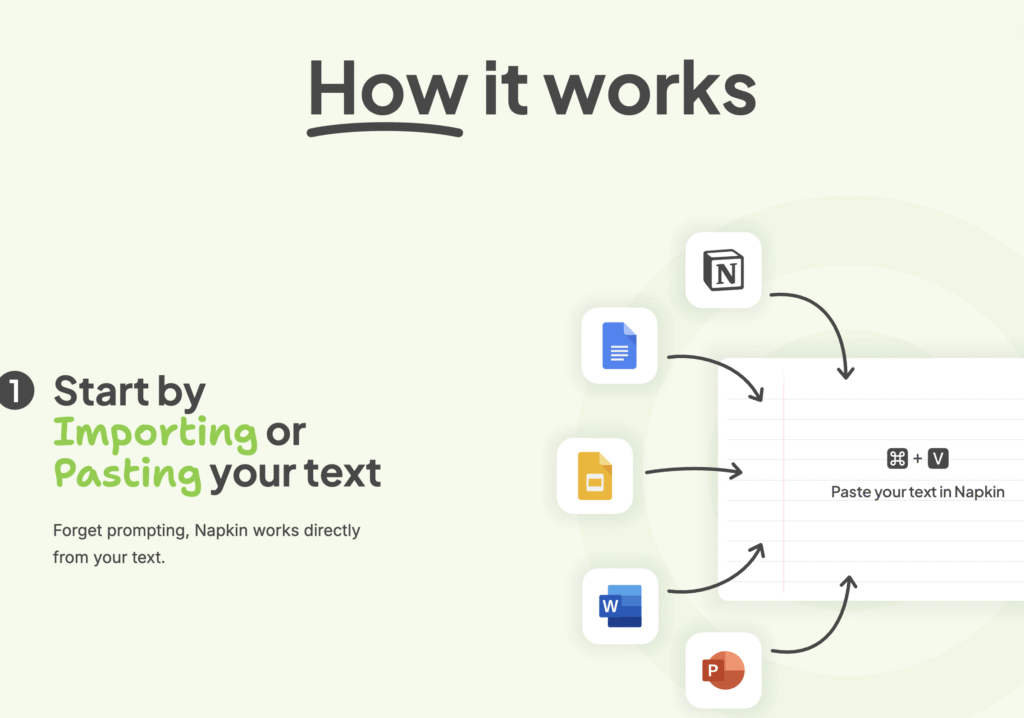
- Start with content you already have (meeting notes, email draft, article outline)
- Paste into Napkin’s canvas (no special formatting needed)
- Highlight a section and click the spark icon
- Review the 4-6 visual options generated
- Select your favorite and customize colors/fonts
- Export as PNG or PDF to share with team
- Celebrate that you just created a professional visual in under 2 minutes
Intermediate Workflow (After 5-10 Visuals):
- Draft your content directly in Napkin’s editor
- Structure content with clear sections/points
- Use custom generation to specify exact visual types needed
- Generate multiple visuals for different sections
- Arrange visuals on canvas to create visual document
- Apply brand colors consistently across all visuals
- Export as PPT for presentation or PDF for sharing
Advanced Workflow (Power Users):
- Build comprehensive visual documents with text and graphics integrated
- Use teamspace for collaborative creation and review
- Apply saved brand styles for instant consistency
- Create libraries of reusable visuals for common topics
- Develop visual templates for recurring content types
- Export in multiple formats for different distribution channels
- Integrate into existing content production workflows
Quick Start Resources
Official Documentation:
- Getting Started Guide: napkin.ai/help (comprehensive written documentation)
- Video Tutorials: YouTube channel with feature walkthroughs
- Live feature: In-app chat widget (bottom right corner, instant support)
Video Walkthrough:
- Official 2-minute overview: Watch on YouTube (linked from napkin.ai homepage)
- “How It Works” page on website includes embedded demo video
- Fast Company feature includes practical demonstration
Community Resources:
- User testimonials and examples: Napkin.ai homepage gallery section
- LinkedIn group: Active community of Napkin users sharing tips and examples
- ProductHunt discussion: Original launch thread with extensive Q&A
Pro Tips from Our Testing:
- Start simple: Your first few visuals should be straightforward content to build confidence
- Save examples: Bookmark visuals you like for inspiration on future projects
- Experiment freely: Credits are for generation only—editing is unlimited, so refine extensively
- Use custom generation: Once comfortable, specify exact visual types for better results
- Keyboard shortcuts: Learn the few shortcuts (copy, paste, undo) to speed up workflow
- Mobile for review: Use mobile app to review team work and approve visuals remotely
- Weekly credit tracking: Free users should track usage to optimize within 500 weekly credits
Common First-Time Questions
Q: Do I need design skills? A: Absolutely not. That’s the entire point. If you can write text, you can create visuals with Napkin.
Q: How long does it take to learn? A: 5 minutes to first usable visual. After creating 10-15 visuals, you’ll be proficient.
Q: What if I don’t like the AI-generated options? A: Click generate again for new options, use custom generation to specify format, or edit the visual extensively—editing is unlimited.
Q: Can I use visuals commercially? A: Yes, all created visuals can be used commercially (check terms of service for specific usage rights).
Q: What happens when I run out of credits? A: Free plan: Credits reset weekly. Paid plans: Credits reset monthly. You can also purchase top-up credits (Pro plan).
Special Launch Offers
Limited-Time Deals
Annual Plan Savings – PERMANENT OFFER:
- Plus Plan: $144/year (save $36 vs monthly) = 25% discount
- Pro Plan: $270/year (save $90 vs monthly) = 25% discount
- Savings: $36-90/year by committing annually Never expires: This is Napkin’s permanent pricing structure
Educational Discount – COMING SOON:
- Napkin mentioned plans for educational pricing but hasn’t yet launched formal program
- Current recommendation: Free plan is “designed to accommodate lightweight educational usage”
- Contact: [email protected] for educational institution inquiries
Non-Profit Consideration:
- No formal non-profit discount currently available
- Free plan recommended for non-profits with light usage
- Contact: [email protected] to inquire about organizational needs
Our Exclusive Recommendations
While Napkin doesn’t currently offer affiliate programs or exclusive promotional codes, we can offer strategic recommendations based on our testing:
Maximize Your Free Trial Strategy:
- Start with free plan to fully test features (genuinely usable, not limited trial)
- Track your usage for 2 weeks to understand credit needs
- Upgrade only when you consistently hit the 500 weekly credit limit
- Choose annual billing when ready to commit (automatic 25% savings)
Team Adoption Strategy:
- One person tries free plan first (2-week evaluation)
- Create 10-15 visuals to demonstrate value to team
- Show time savings with before/after comparison
- Upgrade to paid plan once ROI is clear
- Add team members strategically (paid per seat)
Cost Optimization Tips:
- Combine tools strategically: Use Napkin for business visuals, keep one alternative (Canva free or basic) for creative/social content
- Maximize editing: Generate once, edit extensively to refine (editing doesn’t consume credits)
- Share accounts carefully: Free plan allows unlimited editors, good for small teams testing
- Annual commitment: Only commit to annual once you’ve used for 2+ months and confirmed it’s essential
Value Quantification (Use This to Justify Purchase):
- Track time saved: Document hours spent before Napkin vs. after
- Calculate cost savings: Compare to previous design agency/freelancer costs
- Measure quality improvement: Compare engagement metrics (presentation feedback, article time-on-page, etc.)
- ROI benchmark: If Napkin saves 3+ hours weekly, it pays for Plus plan ($12/month) at minimum wage equivalent
Best Time to Upgrade:
- From Free to Plus: When hitting 500 weekly credits consistently (2+ weeks in a row)
- From Plus to Pro: When needing custom fonts, unlimited brand styles, or creating 250+ visuals monthly
- When to stay free: Creating fewer than 8-10 visuals per week with no branding requirements
Risk-Free Testing Approach
Week 1-2: Free Plan Evaluation
- Create 10-15 diverse visuals
- Test different content types
- Share with colleagues for feedback
- Evaluate time savings
- Decision point: Is this worth $12/month?
Week 3-4: Paid Plan Trial (if upgraded)
- Test advanced features (PPT export, brand removal, custom fonts if Pro)
- Integrate into regular workflow
- Track actual usage patterns
- Final decision: Keep, downgrade, or cancel
30-Day Satisfaction Assessment:
- Time saved per week: ____ hours
- Cost vs. previous solution: $____ savings
- Quality improvement: Measurable? Y/N
- Team adoption: % of team using regularly
- Continue if: Saving 2+ hours weekly OR replacing more expensive solution OR measurably improving output quality
Final Thoughts
Napkin AI has achieved something rare in the crowded AI tools market: it’s actually useful for its intended purpose. The platform delivers on its promise to make visual communication as simple as taking a photo on an iPhone, democratizing professional visual creation for non-designers.
After extensive testing, we’re confident recommending Napkin AI to:
- Content creators drowning in visual content demands
- Business professionals tired of spending hours on presentations
- Educators needing better ways to explain concepts visually
- Marketers managing constant visual content production
- Anyone who has ever thought “I wish I could just show what I mean”
The free tier eliminates risk—start today and create your first visual in under 5 minutes. For professionals creating visuals regularly, the $12/month Plus plan delivers exceptional ROI through dramatic time savings alone.
Start here: napkin.ai
Questions? The support team is responsive via in-app chat or [email protected]
This review reflects extensive hands-on testing conducted over three weeks in November 2025, including creation of 100+ visuals across diverse use cases, testing of all pricing tiers, and comparison against major competitors. All experiences and assessments are based on actual platform usage and represent our independent analysis.
![Napkin AI Everything You Need to Know [2025 Review]](https://gptcopilot.com/wp-content/uploads/thumbs_dir/napkin-ai-2-rer9xn9bkhg5ywcaif2mwmks0y6286yb1vbtxgiigs.png)
![Napkin AI Everything You Need to Know [2025 Review]](https://gptcopilot.com/wp-content/uploads/thumbs_dir/youtube_thumbnail-156-rer30po1usfpk7k8zljs1qkwah6081pqvhl4i5b60s.jpg)
![Napkin AI Everything You Need to Know [2025 Review]](https://gptcopilot.com/wp-content/uploads/thumbs_dir/youtube_thumbnail-155-rer1oq0oxaqosx9r7urhqujog9pd8d73lyiofkgrp8.jpg)